YOPO is an interactive dashboard which generates various standard plots.

Overview

YOPO (You Only Plot Once)

Python Plotly Flask

You Only Plot Once

YOPO is an interactive dashboard which generates various standard plots.you can create various graphs and charts with a click of a button. This tool uses Dash and Flask in backend.

Table of contents

Installing YOPO

To install from PyPi:

pip install yopo

To install from source:

cd <your_project>
git clone https://github.com/chekoduadarsh/YOPO-You-Only-Plot-Once.git
# or download and unzip https://github.com/AutoViML/AutoViz/archive/master.zip
# if you dont have virtualenv install from here https://packaging.python.org/en/latest/guides/installing-using-pip-and-virtual-environments/
python3 -m venv env
source env/bin/activate
git clone https://github.com/chekoduadarsh/YOPO-You-Only-Plot-Once.git
# or download and unzip https://github.com/AutoViML/AutoViz/archive/master.zip
cd yopo
python3 -m pip install .

Usage

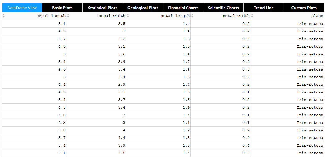
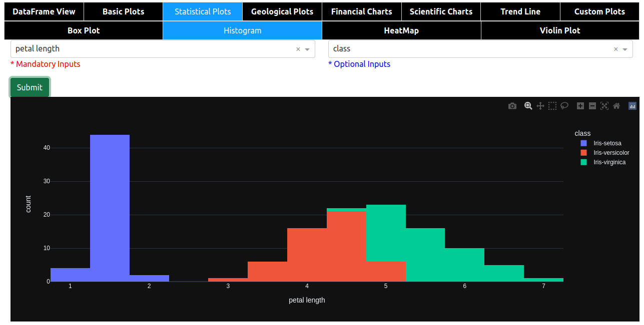
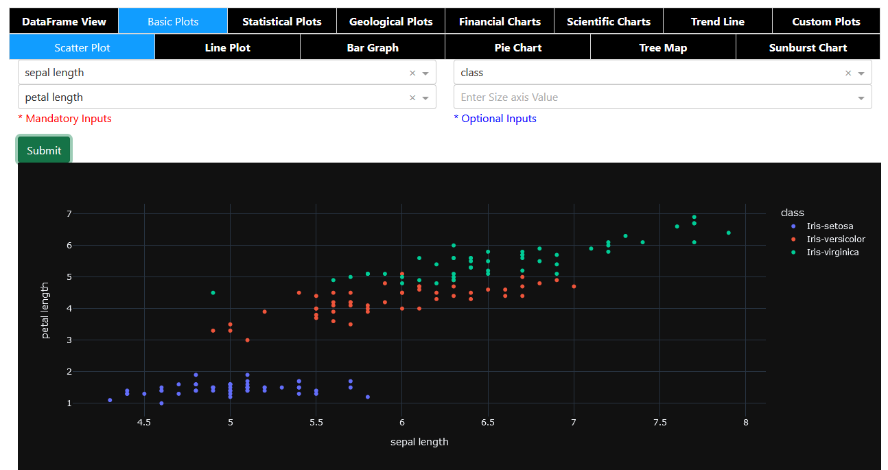
its very easy to use YOPO, u just need to pass the dataframe and it will generate the dashboard.

A code like this will generate multiple plots like given below.

Contribute

If you find any error or need support please raise a issue. If you think you can add a feature, or help solve a bug please raise a PR This repo welcomes any kind of contributions pray

Feel free to adapt it criticize it and support it the way you like!!

License

Apache License, Version 2.0

You might also like...
This package creates clean and beautiful matplotlib plots that work on light and dark backgrounds

This package creates clean and beautiful matplotlib plots that work on light and dark backgrounds. Inspired by the work of Edward Tufte.

Moscow DEG 2021 elections plots

Построение графиков на основе публичных данных о ДЭГ в Москве в 2021г. Описание Скрипты в данном репозитории позволяют собственноручно построить графи

This plugin plots the time you spent on a tag as a histogram.

This plugin plots the time you spent on a tag as a histogram.

A minimal Python package that produces slice plots through h5m DAGMC geometry files

A minimal Python package that produces slice plots through h5m DAGMC geometry files Installation pip install dagmc_geometry_slice_plotter Python API U

MPL Plotter is a Matplotlib based Python plotting library built with the goal of delivering publication-quality plots concisely.

MPL Plotter is a Matplotlib based Python plotting library built with the goal of delivering publication-quality plots concisely.

Generate
Generate "Jupiter" plots for circular genomes

jupiter Generate "Jupiter" plots for circular genomes Description Python scripts to generate plots from ViennaRNA output. Written in "pidgin" python w

A Python function that makes flower plots.

Flower plot A Python 3.9+ function that makes flower plots. Installation This package requires at least Python 3.9. pip install

Standardized plots and visualizations in Python

Standardized plots and visualizations in Python pltviz is a Python package for standardized visualization. Routine and novel plotting approaches are f

The plottify package is makes matplotlib plots more legible

plottify The plottify package is makes matplotlib plots more legible. It's a thin wrapper around matplotlib that automatically adjusts font sizes, sca

Comments
  • Add predefined palettes as dropdown.

    Add predefined palettes as dropdown.

    Is your feature request related to a problem? An enhancement: to give the possibility to choose a color palette from a dropdown menu.

    There are too many predefined palettes at [https://plotly.com/python/builtin-colorscales/](https://plotly.com/python/builtin-colorscales/, and the menu would become too long), so a dozen should be enough.

    As a palette list I would consider:

    • Viridis
    • Magma
    • Turbo
    • Bluered
    • Hot
    • RdBu
    • YlOrRd
    • Thermal
    • Agsunset
    • Balance
    • Portland
    • Edge

    If the dropdown menu shows the palette colors (each image can be downloaded from the page) together with the name, it becomes very intuitive.

    enhancement 
    opened by Nemecsek 4
  • Give the possibility to add extra parameters.

    Give the possibility to add extra parameters.

    Is your feature request related to a problem? I am using Histograms, but the number of bins is automatic and cannot be changed. Other plot types can be optimized by adding extra parameters (i.e. to change the size of scatterplots' markers).

    Describe the solution you'd like Of course it is not possible to add parameters according to every users' needs.

    The easiest solution is to give the possibility to enter extra params into an edit box such as: Screenshot_20220218_092905

    This string can be transformed into a dictionary with eval(f'dict({ edit_box_content })'), and the dictionary then added to the plots' parameters.

    enhancement 
    opened by Nemecsek 2
  • Dataframe's index is missing among the selectable fields in X axis

    Dataframe's index is missing among the selectable fields in X axis

    As for the title, it is not possible to directly select the (unnamed) index among the X axis fields. Index is the most obvious choice for Y axis in Scatter, Line, etc.

    opened by Nemecsek 0
  • Let multiple series to be visualized in a single plot.

    Let multiple series to be visualized in a single plot.

    In Scatter, Line, Bar (and possibly other plots) it would be nice to visualize multiple series on the same figure. This would mean to select not only a single Y axis value, but to allow multiple selections (at least one).

    To keep things simple, I would draw all of them on the same figure, avoiding at the moment to provide sub figures.

    enhancement 
    opened by Nemecsek 1
Releases(alpha)
  • alpha(Feb 15, 2022)

Owner
ADARSH C
Python | Machine Learning | Deep Learning | Flask | mongodb | Embedded systems
ADARSH C
Colormaps for astronomers

cmastro: colormaps for astronomers 🔭 This package contains custom colormaps that have been used in various astronomical applications, similar to cmoc

Adrian Price-Whelan 12 Oct 11, 2022
Rick and Morty Data Visualization with python

Rick and Morty Data Visualization For this project I looked at data for the TV show Rick and Morty Number of Episodes at a Certain Location Here is th

7 Aug 29, 2022
A script written in Python that generate output custom color (HEX or RGB input to x1b hexadecimal)

ColorShell ─ 1.5 Planned for v2: setup.sh for setup alias This script converts HEX and RGB code to x1b x1b is code for colorize outputs, works on ou

Riley 4 Oct 31, 2021
NorthPitch is a python soccer plotting library that sits on top of Matplotlib

NorthPitch is a python soccer plotting library that sits on top of Matplotlib.

Devin Pleuler 30 Feb 22, 2022
Visualize the training curve from the *.csv file (tensorboard format).

Training-Curve-Vis Visualize the training curve from the *.csv file (tensorboard format). Feature Custom labels Curve smoothing Support for multiple c

Luckky 7 Feb 23, 2022
Movies-chart - A CLI app gets the top 250 movies of all time from imdb.com and the top 100 movies from rottentomatoes.com

movies-chart This CLI app gets the top 250 movies of all time from imdb.com and

3 Feb 17, 2022
FairLens is an open source Python library for automatically discovering bias and measuring fairness in data

FairLens FairLens is an open source Python library for automatically discovering bias and measuring fairness in data. The package can be used to quick

Synthesized 69 Dec 15, 2022
A tool to plot and execute Rossmos's Formula, that helps to catch serial criminals using mathematics

Rossmo Plotter A tool to plot and execute Rossmos's Formula using python, that helps to catch serial criminals using mathematics Author: Amlan Saha Ku

Amlan Saha Kundu 3 Aug 29, 2022
Manim is an animation engine for explanatory math videos.

A community-maintained Python framework for creating mathematical animations.

12.4k Dec 30, 2022
A Python library created to assist programmers with complex mathematical functions

libmaths was created not only as a learning experience for me, but as a way to make mathematical models in seconds for Python users using mat

Simple 73 Oct 02, 2022
Script to create an animated data visualisation for categorical timeseries data - GIF choropleth map with annotations.

choropleth_ldn Simple script to create a chloropleth map of London with categorical timeseries data. The script in main.py creates a gif of the most f

1 Oct 07, 2021
Process dataframe in a easily way.

Popanda Written by Shengxuan Wang at OSU. Used for processing dataframe, especially for machine learning. The name is from "Po" in the movie Kung Fu P

ShawnWang 1 Dec 24, 2021
Complex heatmaps are efficient to visualize associations between different sources of data sets and reveal potential patterns.

Make Complex Heatmaps Complex heatmaps are efficient to visualize associations between different sources of data sets and reveal potential patterns. H

Zuguang Gu 973 Jan 09, 2023
Create 3d loss surface visualizations, with optimizer path. Issues welcome!

MLVTK A loss surface visualization tool Simple feed-forward network trained on chess data, using elu activation and Adam optimizer Simple feed-forward

7 Dec 21, 2022
DrawBot lets you draw images taken from the internet on Skribbl.io, Gartic Phone and Paint

DrawBot You don't speak french? No worries, english translation is over here. C'est quoi ? DrawBot est un logiciel codé par V2F qui va prendre possess

V2F 205 Jan 01, 2023
Example Code Notebooks for Data Visualization in Python

This repository contains sample code scripts for creating awesome data visualizations from scratch using different python libraries (such as matplotli

Javed Ali 27 Jan 04, 2023
Use Perspective to create the chart for the trader’s dashboard

Task Overview | Installation Instructions | Link to Module 3 Introduction Experience Technology at JP Morgan Chase Try out what real work is like in t

Abdulazeez Jimoh 1 Jan 22, 2022
Backend app for visualizing CANedge log files in Grafana (directly from local disk or S3)

CANedge Grafana Backend - Visualize CAN/LIN Data in Dashboards This project enables easy dashboard visualization of log files from the CANedge CAN/LIN

13 Dec 15, 2022
visualize_ML is a python package made to visualize some of the steps involved while dealing with a Machine Learning problem

visualize_ML visualize_ML is a python package made to visualize some of the steps involved while dealing with a Machine Learning problem. It is build

Ayush Singh 164 Dec 12, 2022